Green V Red
Color coding in Hitchcock’s Vertigo
A key element in filmmaking (or any visual medium) that helps create the look is how color is used. Not in the grade, but color palettes in production design.
Wes Anderson is probably the most obvious current practitioner.

Even in seemingly naturalistic presentations, a close examination shows most films/TV shows controlled use of color.


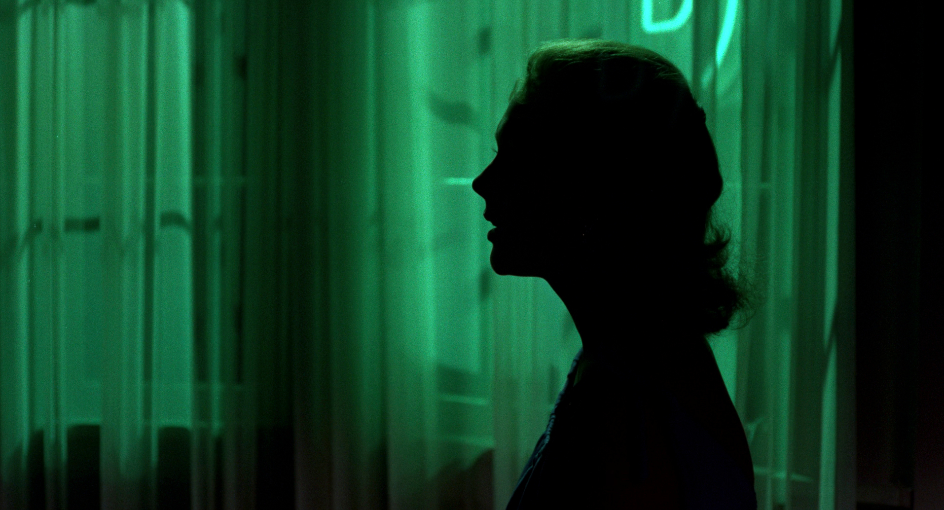
A classic example of using color to reveal character dynamics is Vertigo. Right from the opening frames we’re keyed into the special significance of red and green. The red room, cool tones and neutrals of the crowd, and then Kim Novak emerges in emerald green.


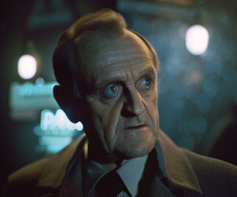
Bob Newhart in the World of Blade Runner
And other adventures in AI “art.”

Like everyone else working in content and media, I’ve been messing around with AI art and text. There are some thorny questions around automating human effort the ethics around how the machine was trained. Others have weighed in so I won’t here.
I was mostly staying away, and then a VXF supervisor friend convinced me to dig in a little more. He uses Midjourney to make quick look books and rough in tone/vibe. This makes a lot of sense to me. With the carefully considered prompts, you can get to fairly specific looks more quickly than you could searching for swipe and/or sketching (especially you’re me and you haven’t really been cultivating your drafting skills lately).


Chez Panisse

I grew up in Berkeley, California a few blocks away from the famed restaurant, Chez Panisse. Opened in 1971 by Alice Waters and Paul Aratow, it has always maintained a rigorous adherence to an ethos emphasizing high quality, locally sourced and in season ingredients prepared with a French influenced technique.
There’s a formal dining room downstairs with a set menu that changes daily and a less formal cafe upstairs with a more generally predictable menu. I’ve never eaten downstairs, but we would go to the cafe fairly regularly when I was a kid—my artist dad’s circle included David Lance Goines, who designed a lot of the posters and collateral that defined the Chez Panisse brand, and my grandfather liked to take us for lunch.
You can make reservations a month in advance for both the cafe and restaurant, and they always fills up in minutes. They’ve remodeled twice over the years, both times due to fires, but never expanded the seating. The brand is so revered by foodies that they could easily find whatever financing and support to expand or open new locations. Or raise their prices ($175 a person for the prix fix isn’t cheap, but since demand wildly exceeds supply, certainly isn’t maxed). Waters has written a few cookbooks, but has otherwise resisted growing the business as other restauranteurs of her generation who brought French influence to American cooking did.
It’s Christmas Eve as I write this, and I keep thinking about how refreshing it is that Chez Panisse stays focused on sustainably nurturing the brand amidst the fervor of late capitalism to extract every possible ounce of value out of everything, even if it means destroying what was great about it in the first place.
We need more Chez Panisses in the world. Not literally—the one is perfect—but in spirit.

YoFi!
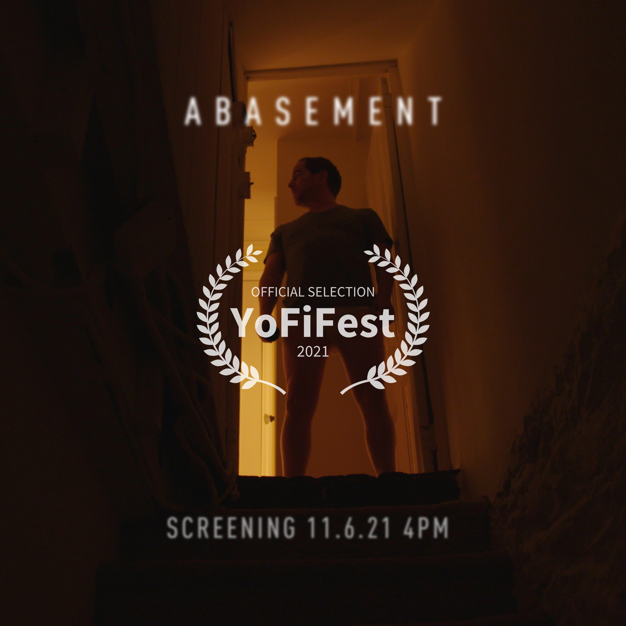
Abasement was invited to screen at the YoFi Festival. This was the first in person festival I’ve actually been able to attend. My first short was schedule to premiere in April 2020, and we all know what happened there…
That film screened virtually with them last year, and they did a really amazing jobs of making it feel like a festival, so I was really excited to come back. Yonkers is a haul from Brooklyn, but I managed to attend the opening party and a few screenings.

We screened in the horror shorts block, with a bunch of cool films. Standouts included Koreatown Ghost Story (featuring Margaret Cho, in a subversive turn) by Minsun Park & Teddy Tenenbaum, and Household Demons by John Gray.
In between screenings, I got to meet a bunch of fellow indie filmmakers. It’s great to see how different folks look at navigating the often muddy world of independent filmmaking. Some very much have their sites firming focused on Hollywood, others are fiercely independent.
Waiting for the show Documenting the documenting Opening party Scoring
Patty and Dave of Yofi Festival did a really great job making a filmmaker friendly experience come to life.

Your horse is not a motorcycle
A few stray thoughts on leadership.
When perched astride a horse, it’s tempting to think of her as you might a motorcycle—point it in the direction you want, hit the gas, and go—but this would be an error. While you may be in charge, your horse has feelings about the desired direction, footing, and speed, and the more you can get her onboard with the general plan, the more helpful she’ll be.

When moseying along an easy trail, it might not make much difference if your horse is with you or not, though as anyone who’s dealt with a cranky horse can attest, it isn’t much fun. When trying to do something more complex, however, such as wrangling cattle, it’s critical your horse is aligned because she’s the one who has to do the actual ‘hands on’ work of peeling a cow from the herd and guiding it into the pen. You might be pointing out which cow to nab, but then it’s largely up to her, with your help and guidance.
Leveraging the strengths of your team (i.e. peeling cows from the herd) is an effective way to get them invested in the outcome of the project.
If you think of leadership as control, this will be frustrating. But if you think of it as being about supporting your team’s success, it becomes much easier. We’ve all had leaders who micro-manage every aspect of the process. It’s demoralizing and enthusiasm crushing. Instead of building momentum and galloping to the goal, the energy drags to a halt, starting a vicious cycle. This is obviously not how you get the best work from them. Set the vision, empower your team, and give them the tools they need to succeed.
Your horse is not a motorcycle. Partnership and support will take you farther, faster.

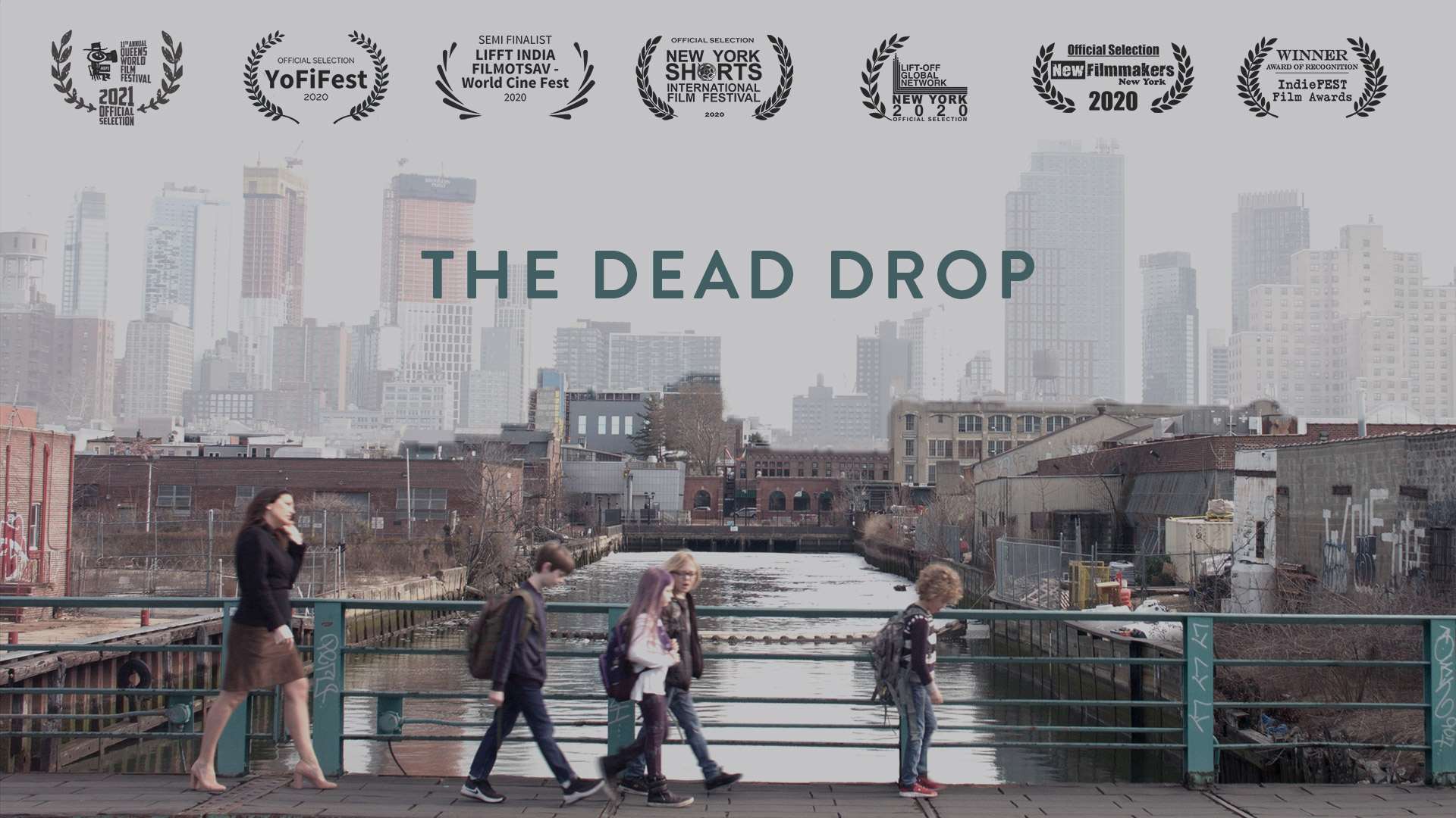
The Dead Drop at Queens World

My first short, The Dead Drop, has been selected for Queens World Film Festival. Assuming no major reversals in reopening, we’ll have a live screening June 26 at the Queens Theatre in Flushing NY, and then virtual screenings through Film Festival Flix.

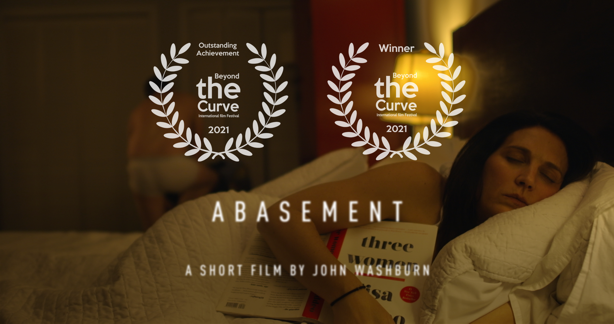
Abasement wins Best Horror
I woke up this morning to find Abasement had snagged Best Horror at Beyond the Curve International Film Festival in Paris, France.
It’s our twelfth festival selection, ninth nomination/finalist nod, and fourth win. Once we’ve finished the festival run, I might post our stats, including all our losses.

BCIFF just popped up on my radar a few months ago. The fest was one of those things where once you spot it, it’s suddenly everywhere, and my interest was piqued, but I was kind of intimidated by their manifesto (first in French, then in English), an excerpt of which reads “We strive to provide a platform for those who think ‘beyond the curve’. ‘The Curve’ represents the limitations filmmakers are bound to because of the commercial exploitation of the art called ‘cinema’. We choose to present a platform where films are not means of commercial narrative but weapons of change and a call to action.“
Abasement is this quiet little existential meditation masquerading as a “horror” movie. So not really “Hollywood tent pole” material, but hardly a weapon of change. I said as much to Lisa, a programmer for the festival, and she laughed and encouraged me to submit anyway.
There’s a lesson in there: Make. Ship. Repeat.

Modernista!

I had my second vaccine dose today. The anti-vaxxers find it “performative” to share, I guess, but I’m okay with that. (My position on vaccines is pretty well established.) Normalizing vaccination shouldn’t need to be a thing, but apparently it is. Perhaps the most disruptive global event in the last 75 years has a clear path to resolution, if only we all do our bit. And if my sharing provides some measure of cover to someone on the fence? Worth it.
Just like the how the side-effects starting to hit me are worth it. Ugh!

Font Nerdy 2: Futura
The other week I wrote a font “coming of age” story. I have another, this time featuring Futura, and some of her decendents.
Released in 1927 by the Bauer Type Foundry, Futura was designed by the German typographer Paul Renner before he scuppered his career with an anti-Nazi pamphlet Kulturbolschewismus (which I’ll confess I’ve never read). It was a departure from the late 19th/early 20th century “print jobber” typefaces like Akzidenz-Grotesk or Franklin Gothic in that it completely abandoned so called humanist proportions for purer hard geometry. The “O” is basically a perfect circle with almost no variation in the stroke.