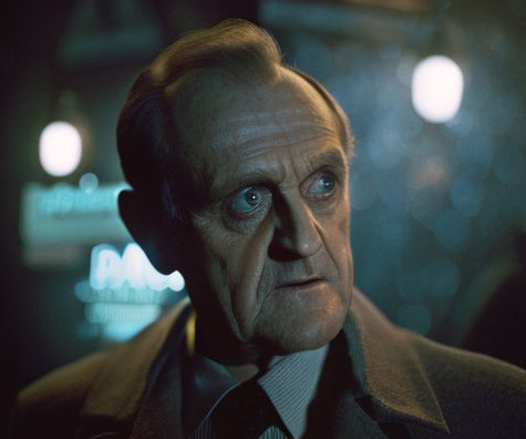
Bob Newhart in the World of Blade Runner
And other adventures in AI “art.”

Like everyone else working in content and media, I’ve been messing around with AI art and text. There are some thorny questions around automating human effort the ethics around how the machine was trained. Others have weighed in so I won’t here.
I was mostly staying away, and then a VXF supervisor friend convinced me to dig in a little more. He uses Midjourney to make quick look books and rough in tone/vibe. This makes a lot of sense to me. With the carefully considered prompts, you can get to fairly specific looks more quickly than you could searching for swipe and/or sketching (especially you’re me and you haven’t really been cultivating your drafting skills lately).


Your horse is not a motorcycle
A few stray thoughts on leadership.
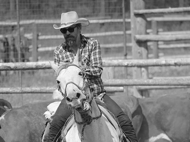
When perched astride a horse, it’s tempting to think of her as you might a motorcycle—point it in the direction you want, hit the gas, and go—but this would be an error. While you may be in charge, your horse has feelings about the desired direction, footing, and speed, and the more you can get her onboard with the general plan, the more helpful she’ll be.

When moseying along an easy trail, it might not make much difference if your horse is with you or not, though as anyone who’s dealt with a cranky horse can attest, it isn’t much fun. When trying to do something more complex, however, such as wrangling cattle, it’s critical your horse is aligned because she’s the one who has to do the actual ‘hands on’ work of peeling a cow from the herd and guiding it into the pen. You might be pointing out which cow to nab, but then it’s largely up to her, with your help and guidance.
Leveraging the strengths of your team (i.e. peeling cows from the herd) is an effective way to get them invested in the outcome of the project.
If you think of leadership as control, this will be frustrating. But if you think of it as being about supporting your team’s success, it becomes much easier. We’ve all had leaders who micro-manage every aspect of the process. It’s demoralizing and enthusiasm crushing. Instead of building momentum and galloping to the goal, the energy drags to a halt, starting a vicious cycle. This is obviously not how you get the best work from them. Set the vision, empower your team, and give them the tools they need to succeed.
Your horse is not a motorcycle. Partnership and support will take you farther, faster.

Modernista!

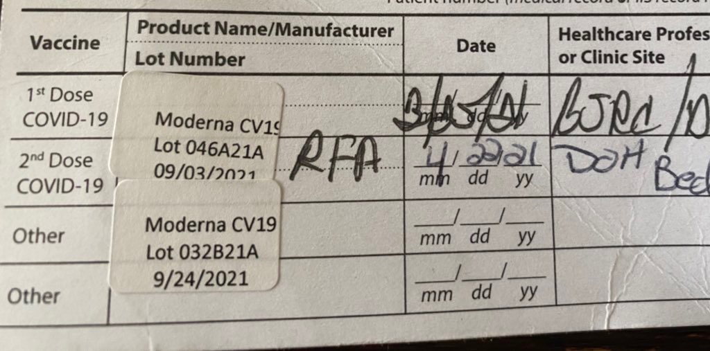
I had my second vaccine dose today. The anti-vaxxers find it “performative” to share, I guess, but I’m okay with that. (My position on vaccines is pretty well established.) Normalizing vaccination shouldn’t need to be a thing, but apparently it is. Perhaps the most disruptive global event in the last 75 years has a clear path to resolution, if only we all do our bit. And if my sharing provides some measure of cover to someone on the fence? Worth it.
Just like the how the side-effects starting to hit me are worth it. Ugh!

Font Nerdy 2: Futura
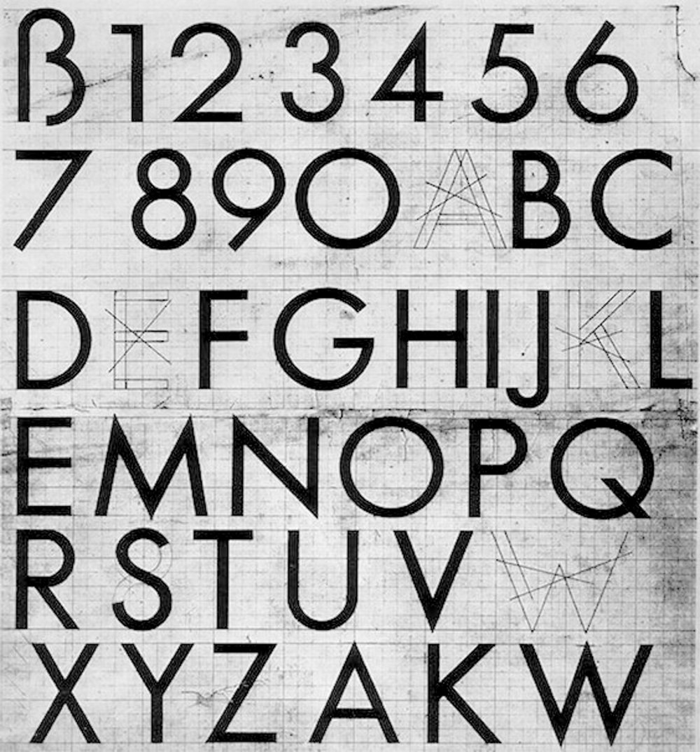
The other week I wrote a font “coming of age” story. I have another, this time featuring Futura, and some of her decendents.
Released in 1927 by the Bauer Type Foundry, Futura was designed by the German typographer Paul Renner before he scuppered his career with an anti-Nazi pamphlet Kulturbolschewismus (which I’ll confess I’ve never read). It was a departure from the late 19th/early 20th century “print jobber” typefaces like Akzidenz-Grotesk or Franklin Gothic in that it completely abandoned so called humanist proportions for purer hard geometry. The “O” is basically a perfect circle with almost no variation in the stroke.


Font nerdy
I remember the first time I was moved nearly to tears by a typeface. It was at an art supply store in the East Village in the early ‘90s. In those days, the web didn’t really exist yet, so research was something you had to do on foot.
I was playing guitar in a hazy, nominally gothy band and had taken on the graphic design duties (what ultimately started me on the path that became ‘advertising’). We were all obsessed with the graphic design being produced by Vaughan Oliver for the record label 4AD.


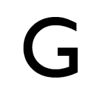
Trying to unlock his secrets, I would spend hours looking at type specimens. And then I found it. Gill Sans medium. The capital “G” hit me like a cudgel right to my heart. (Later, when I was working on W Hotels at RDAI, I had to work with Gill Sans all the time, and that experience cured me entirely of my affection for the font.)

But I didn’t have access to a Mac back then, so typesetting was all via Letraset. I somehow got ahold of a typographer’s ruler, with picas and points, and would carefully measure out each phrase and then painstakingly rub the letters in. I could never get the kerning right, but I spent an absurd number of hours trying. I think in some ways I cared more about typography in those days than I did the music. Maybe if I spent more time practicing guitar and less time trying to make Letraset look like proper typesetting, we would have made it… (Narrator: “They would not have.”)
The second typeface that got me in the gut was Garamond. Specifically the lower case ‘a’ from Garamond #3 from Linotype.

This was later. I was out of college and working for a small multimedia studio in Tribeca. I forget why, or what I was doing, but I needed get close in on the work and zoomed in (we were now on Macs) so the character filled the whole screen, and the majesty of it—the sheer beauty—just kicked me right in the face.
The third typeface that emotionally struck me was Helvetica, but in a different way. Many designers successfully crank out wonderful work with it out all day long, but Helvetica and I have never quite gotten along. The capital R is, to my eye, as wretched and ugly a creature as can be wrought, at least by a serious person.

That awkward curve at the top of the leg… WTF? And the weird spur at the bottom, like some vestigial serif equivalent of a tailbone. But it’s not vestigial at all—Helvetica is the bastard child of the 19th Century “print jobber” family Akzidenz Grotesk, which has a perfectly sensible straight leg and no spur.
I really want to like it. I love a lot of things set in Helvetica. My beloved copy of Müller-Brockmann’s Raster Systeme Fur Die Visuele Gestaltung sits proudly on my desk. But I just can’t. In my hands, and in the work for which I am accountable, it just sits wrong.

Make something beautiful
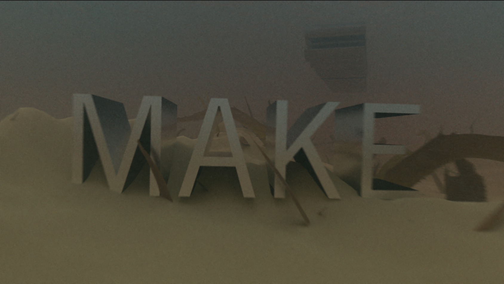
Let’s make something beautiful? (Turn on the sound)
I think it’s sometimes hard to demonstrate practical creativity in a meaningful way. After all, the function of creative in a marketing context is to engage the audience enough to get the message, which is not always aligned with the business objective. A lot of “bad” advertising is the result of prioritizing the marketer’s priorities over the audience’s. A lot of “great” advertising is just about making a nugget of content worth experiencing and then tagging a logo at the end. (Geico notoriously does this well.)
Here I just wanted to make something pretty for a promotional piece where “beautiful’ was the message.