
Color coding in Hitchcock’s Vertigo
A key element in filmmaking (or any visual medium) that helps create the look is how color is used. Not in the grade, but color palettes in production design.
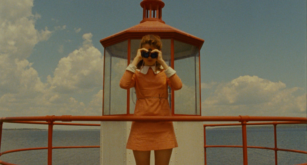
Wes Anderson is probably the most obvious current practitioner.
Even in seemingly naturalistic presentations, a close examination shows most films/TV shows controlled use of color.
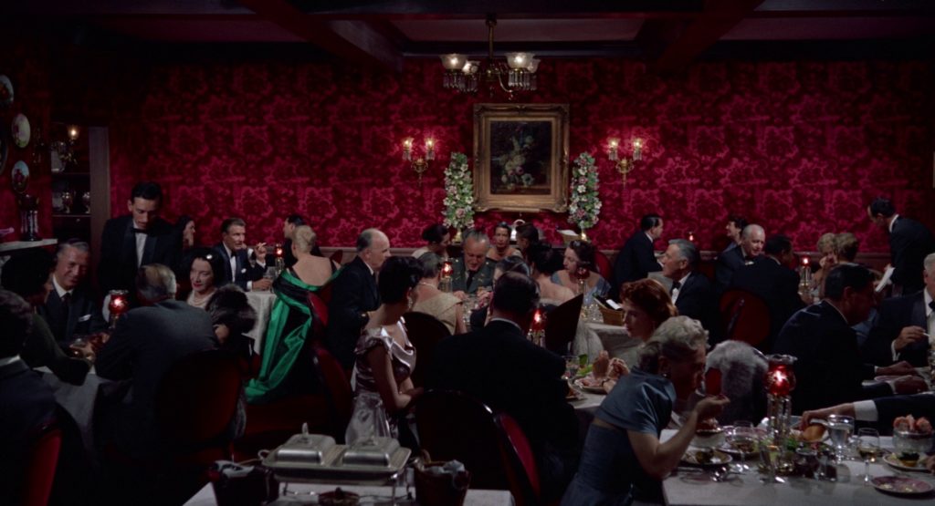
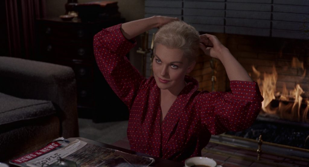
A classic example of using color to reveal character dynamics is Vertigo. Right from the opening frames we’re keyed into the special significance of red and green. The red room, cool tones and neutrals of the crowd, and then Kim Novak emerges in emerald green.
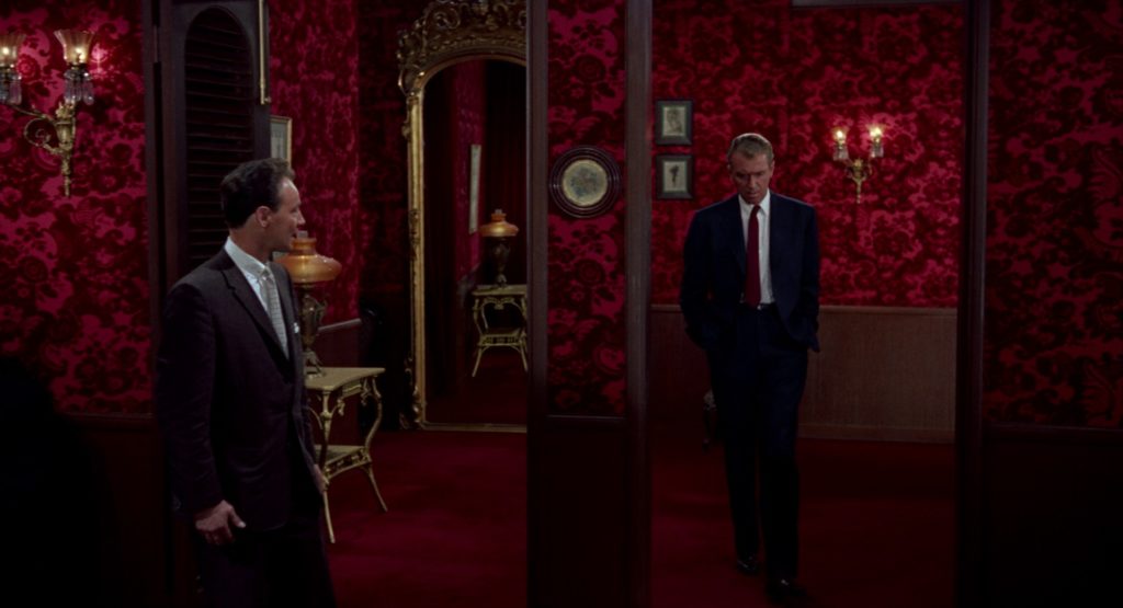
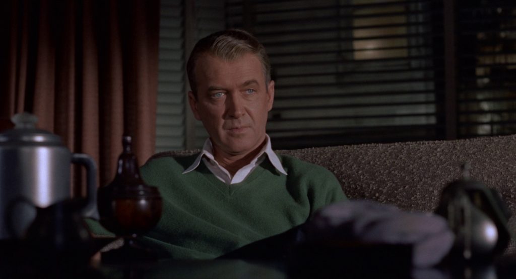
When we meet Jimmy Stewart, he’s in blue with a red tie. Right from the get, even if we haven’t consciously keyed into her green dress, it’s clear he’s integrated into the environment and she isn’t–they are set in opposition.
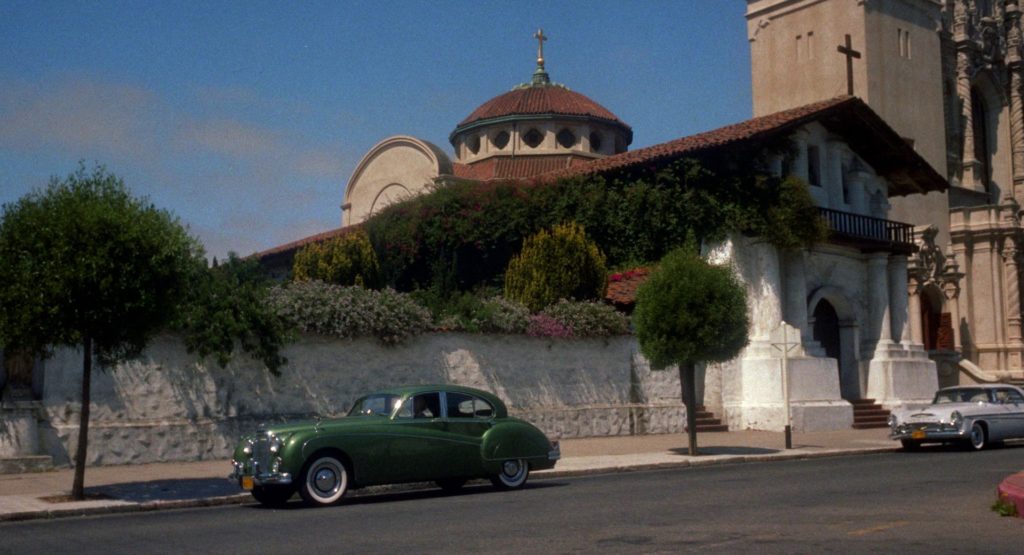
Everything is coded. Here’s an innocuous establishing shot with her green car parked outside the white mission with red tile roof.
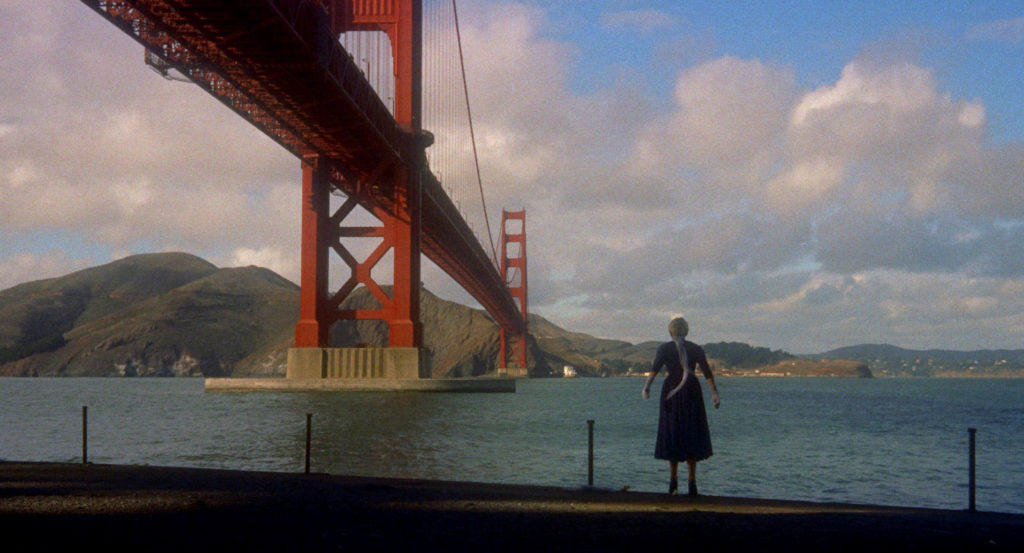
Even when she’s about to jump into the drink, it’s under the (very red) Golden Gate Bridge.
But then after Stewart fishes her out of the bay, the color coding is reversed–she’s in red and he’s green, symbolizing a shift in their relationship.
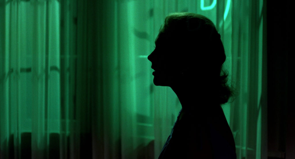
And later, when Stewart finally confronts her as her new identity, it’s in dramatic emerald backlight.
This is maybe a slightly reductionist approach for contemporary tastes, but I find it inspiring, at least as a way in. And certainly controlled color palettes are integral to a polished look, which is generally defined upfront and isn’t something you can create in the grade.

A bit more copy, including the key phrase “color palettes” to appease the seo bot.