
I remember the first time I was moved nearly to tears by a typeface. It was at an art supply store in the East Village in the early ‘90s. In those days, the web didn’t really exist yet, so research was something you had to do on foot.
I was playing guitar in a hazy, nominally gothy band and had taken on the graphic design duties (what ultimately started me on the path that became ‘advertising’). We were all obsessed with the graphic design being produced by Vaughan Oliver for the record label 4AD.
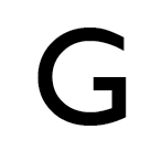
Trying to unlock his secrets, I would spend hours looking at type specimens. And then I found it. Gill Sans medium. The capital “G” hit me like a cudgel right to my heart. (Later, when I was working on W Hotels at RDAI, I had to work with Gill Sans all the time, and that experience cured me entirely of my affection for the font.)
But I didn’t have access to a Mac back then, so typesetting was all via Letraset. I somehow got ahold of a typographer’s ruler, with picas and points, and would carefully measure out each phrase and then painstakingly rub the letters in. I could never get the kerning right, but I spent an absurd number of hours trying. I think in some ways I cared more about typography in those days than I did the music. Maybe if I spent more time practicing guitar and less time trying to make Letraset look like proper typesetting, we would have made it… (Narrator: “They would not have.”)
The second typeface that got me in the gut was Garamond. Specifically the lower case ‘a’ from Garamond #3 from Linotype.
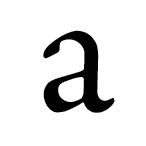
This was later. I was out of college and working for a small multimedia studio in Tribeca. I forget why, or what I was doing, but I needed get close in on the work and zoomed in (we were now on Macs) so the character filled the whole screen, and the majesty of it—the sheer beauty—just kicked me right in the face.
The third typeface that emotionally struck me was Helvetica, but in a different way. Many designers successfully crank out wonderful work with it out all day long, but Helvetica and I have never quite gotten along. The capital R is, to my eye, as wretched and ugly a creature as can be wrought, at least by a serious person.
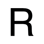
That awkward curve at the top of the leg… WTF? And the weird spur at the bottom, like some vestigial serif equivalent of a tailbone. But it’s not vestigial at all—Helvetica is the bastard child of the 19th Century “print jobber” family Akzidenz Grotesk, which has a perfectly sensible straight leg and no spur.
I really want to like it. I love a lot of things set in Helvetica. My beloved copy of Müller-Brockmann’s Raster Systeme Fur Die Visuele Gestaltung sits proudly on my desk. But I just can’t. In my hands, and in the work for which I am accountable, it just sits wrong.