
The other week I wrote a font “coming of age” story. I have another, this time featuring Futura, and some of her decendents.
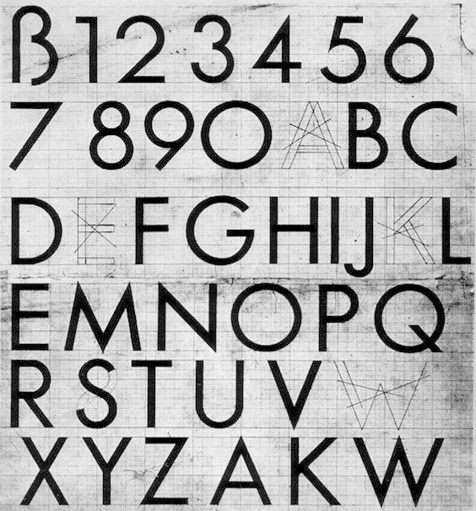
Released in 1927 by the Bauer Type Foundry, Futura was designed by the German typographer Paul Renner before he scuppered his career with an anti-Nazi pamphlet Kulturbolschewismus (which I’ll confess I’ve never read). It was a departure from the late 19th/early 20th century “print jobber” typefaces like Akzidenz-Grotesk or Franklin Gothic in that it completely abandoned so called humanist proportions for purer hard geometry. The “O” is basically a perfect circle with almost no variation in the stroke.
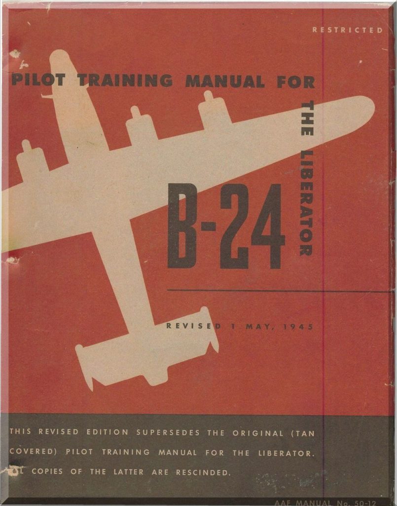
I just love a good cut of Futura Medium, tracked wide in all caps. It reminds me of American WW2 pilot manuals.
This is a bit ironic, Futura being a German design? Though maybe it’s actually ironic in more of an Alanis Morrisette kind of way, what with Herr Renner being a committed enough anti-Nazi to get arrested as soon as they came to power and have to slip off to Switzerland until after the war. (I’m pro-Anti Nazi, but we digress.)
I’ve always loved Futura and overused it like Vignelli abused Helvetica, but then for a while kind of forced myself away because it was becoming almost a lazy default.
Full disclosure: I find spec’ing typefaces to be a bit stressful so having a go to is comforting. But I also always order the same dish every time I go to a particular restaurant, which I think is related, so not sure what that says about me.
The several years I worked at an agency where Futura was the corporate brand typeface were happy in that respect. Biz dev deck? Corp web site? Futura!
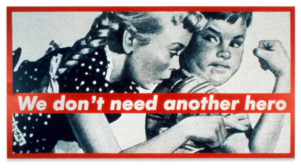
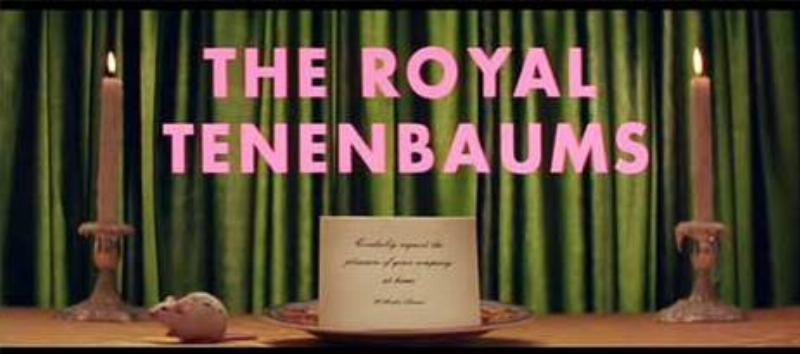
It’s also made it’s way into popular culture in some pretty fantastic ways.
Now, as wonderful as Futura is (I will fight you), it’s spawned some sorry derivatives.
First up is Herb Lubalin’s Avant Guard, which is about as ’70s as you can get without hitting the roller disco. (All respect to Mr Lubalin.) It had a resurgence in the early 2000s which I found vexing at first, but which eventually grew on me.
But as Ed Benguiat, who drew the condensed weight (and many other fonts you know) famously said, “The only place Avant Garde looks good is in the words Avant Garde. Everybody ruins it. They lean the letters the wrong way.”

Next up is Century Gothic. What a horrific travesty. It’s funny, because it’s basically the exact same thing as Futura, except no. Released in 1991 by Monotype, it falls deep into the uncanny valley of shittiness.
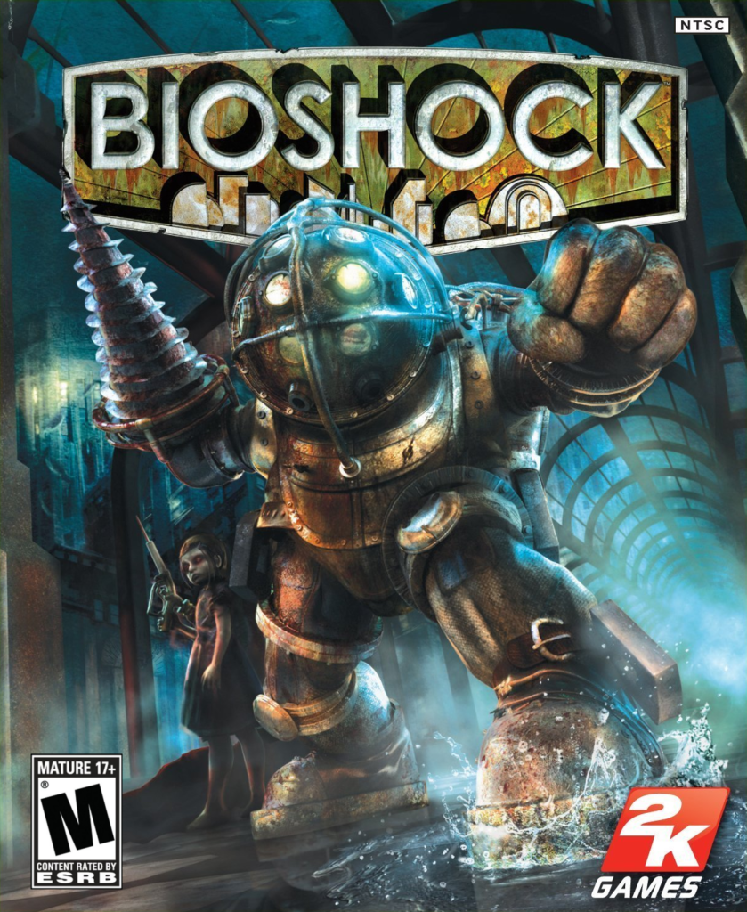
Way back when I was at the now shuttered RDA, we were working on the release of the first Bioshock for 2k Games, and went over to their offices to check it out. Something about it really bugged me and I couldn’t quite put my finger on it. Eventually I realized that the game—which hinges on the discovery in the 1960s of a utopian underwater city from the 1940s—uses Century, designed in the 1990s, for in-game signage and packaging, clearly trying to evoke Futura. And it’s just not the same.
Yep, nerdy. But it’s illustrative of why it’s important to sweat the details. The difference between iconic and apocalyptic can be millimeters. Or less.
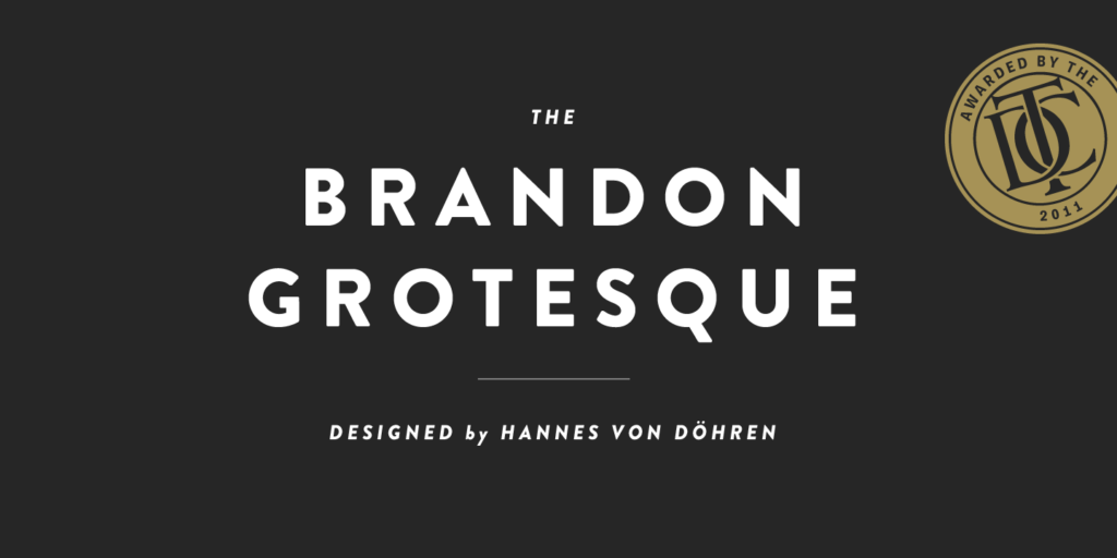
On the flip side, Brandon Grotesque is another geometric sans clearly influenced by Futura but instead of succumbing to the shortcomings of Century, it reimagines it and refreshes in a modern retelling. Many of the uppercase characters are close siblings, except for slightly rounded terminals. And the tail on that Q? Yes, please.
Designed by Hannes von Döhren (another German!) for HvD and released in 2010, the bold is especially satisfying.
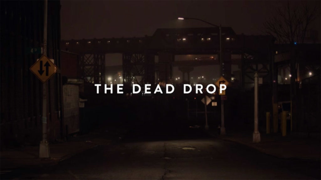
(Self-pimp alert!) I used it to set the titles of my short, The Dead Drop. The lowered cross bar on the A classes up the mood a little, and the subtle radii on the terminals softens it, but it’s delicious in the same way that something set similarly in Futura would be.